Tag Archives: Calligraphy

Scary Acrylic & ink painting on collaged paper on canvas, 7"x11"

Scary: Acrylic painting, Illustrated lettering of inspirational message by Leah Palmer Preiss
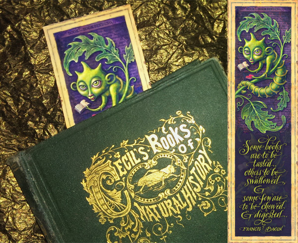
This painting has been an adventure in itself. I’d originally created the design around a wonderful quotation, but alas, I was unable to get permission from the writer’s estate, & that took the wind out of my sails for a while. Then it occurred to me that I could make up my own message, so I was back in action! It isn’t as perfect as the original, but it gets the point across.

Just as things were finally rolling again, I had to put the project on hold for quite some time to finish a massive rush job. Such is the freelance life. But I’ve been able to get back to it at last & I think it’s almost finished! Though I’m considering offering personalized messages in the bottom scroll area where I previously had the author’s name & now have “Enjoy the journey!” Anybody have any ideas?

Bookmarks & Landmarks News

Digital Bookmark art by Leah Palmer Preiss

Do you want voracious bookworms in all your books? Of course you do! My latest Etsy addition is a downloadable digital bookmark based on my library painting, Voracious. The image features one of my very favorite Fleam finds, Cecil’s Book of Insects, 1872.

A new landmark for my sister yesterday: she was able to move her left leg for the first time since her stroke! Go Sarah! :-)

& Now… A New Curiotype Ampersand! Digital Illustration (Photoshop)

Curiotype Ampersand Digital Art by Leah Palmer PreissI have a real thing for ampersands. In fact I chose the font for this site in part because the italic ampersand gives me a tiny tendril-loving thrill every time I see it. :-) (& & & & &…. do you feel it too?) So when someone asked if I had an ampersand to go with my original Curiotype Alphabet, I was more than delighted to add one! I may yet give it a bit more tweaking but here’s what I’ve come up with so far.

The ampersand, by its very nature, brings things together– not only as a conjunction but as a letterform. Its original shape was derived from a calligraphic intertwining of the letters “e” & “t” (“et” is Latin for “and”)– although many modern versions take the basic shape & run with it to a nearly unrecognizable direction. That’s one of the things I love about the ampersand– it’s a chance for a calligrapher or type designer to throw caution to the wind & really play with form.

So I thought it was only right that there should be a pair of creatures involved in this Curiotype. And given my love of ampersands & the proximity of Valentine’s Day, I figured they should be rather taken with one another.

Stay tuned for more Curiotype developments AND more Valentine’s goodness! In the meantime I hope you are enjoying your new year & everything that comes with it!

edit: Now available as an ACEO-sized print in my Etsy shop!